In the globalized data era, companies are left to data analysts to make sense of complex information and package it in a manner that is easily understandable, entertaining and effective. And that is where data visualization tools come into the picture. They convert raw data into charts, graphs, dashboards and interactive graphics- simplifying the process of interpretation of trends and insights among decision-makers.
Good news though is that you do not have to have costly software to start. In 2025, there are many free data visualization tools, which enable students, novices, and professionals to make potent visuals without bending the bank. In IFDA Institute, we equip learners to master these tools to enable them to be unique in the competitive analytics environment.
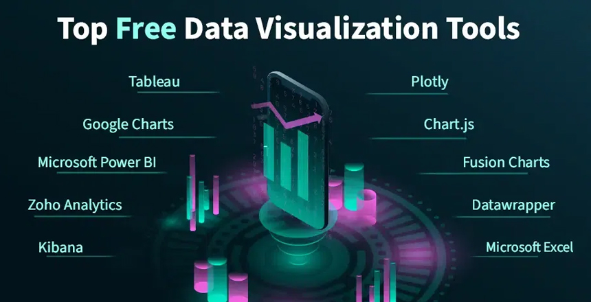
Now we are going to explore the best free data visualization tools that every analyst should test.
1. Microsoft Power BI (Free Version)
Why It’s Popular:
Power BI of Microsoft is among the most popular analytics industry tools. A free version can enable users to import data via Excel, CSV or online sources and then make dashboards and reports.
Key Features:
- Visual creation interface that is dragged and dropped.
- Integration with Excel (a bonus for finance and business students).
- AI-powered insights.
Best: The first is good when a person is a beginner who would like to work on real data, and the second when the person needs a boost on his or her resume.
2. Google Data Studio (Now Looker Studio)
Why It’s Popular:
Google has renamed its Data Studio to Looker Studio, but the free capabilities are potent. It is an online application that is ideal in interactive dashboards and online data visualization sharing.
Key Features:
- Easy integration with Google Analytics, Sheets, and Ads.
- Real-time collaboration, just like Google Docs.
- Professional-looking dashboards for businesses.
Best For: Digital marketer, e-commerce analyst and students desiring a free and cloud-based solution.
3. Tableau Public
Why It’s Popular:
Tableau is regarded as a data visualization gold standard. The public version is also free and enables the analysts to practice and publish dashboards on the internet.
Key Features:
- Rich library of visualization types (maps, scatter plots, heatmaps).
- Drag-and-drop design.
- Post on social media as a way to showcase.
Best With: Students that are developing a data visualization portfolio or job seekers that want recruiters to view their work.
4. RAWGraphs
Why It’s Popular:
RawGraphs is the ideal choice, should you want a lightweight, yet creative tool. It is a free-software platform letting you make unusual and gorgeous visuals.
Key Features:
- No logins required- totally free.
- Custom charts like chord diagrams and Sankey graphs.
- Export to presentations as vectors.
Best For: Designers, researchers and creative analysts that require something beyond the typical bar and line charts.
5. Datawrapper
Why It’s Popular:
Journalists and media houses are all over Datawrapper since it makes it such an easy task to publish charts on their websites.
Key Features:
- No coding required.
- Responsive designs (works on desktop and mobile).
- Professional-looking charts and maps.
Best For: Bloggers, media professionals and students who would like to create charts with articles/reports.
6. ChartBlocks
Why It’s Popular:
ChartBlocks is a minimal interactive chart creation and sharing tool. It is web-based and thus does not need to be installed intensively.
Key Features:
- Easy chart builder for non-technical users.
- Export charts for social media or presentations.
- The free version supports basic charts.
Best suited: to students presenting and small companies creating brief reports.
7. Zoho Analytics (Free Version)
Why It’s Popular:
Zoho has a free edition of its analytics suite, which small businesses and individuals can use to build dashboards.
Key Features:
- Cloud-based with real-time data connections.
- AI-powered insights and trend forecasting.
- Mobile-friendly dashboards.
Best For: Business learners and entrepreneurs in need of end to end data analysis.
8. Plotly
Why It’s Popular:
Plotly is a free open source software among data scientists and programmers. Plotly can be used to create inter-active and advanced visualizations in case you are familiar with Python or R.
Key Features:
- Highly customizable visuals.
- Integration with Jupyter notebooks.
- Professional-level analytics.
Best When: You are a student enrolled in data science classes, or an analyst who already knows how to code.
9. Grafana
Why It’s Popular:
Grafana is ideal to monitor real-time data, commonly in the IT, cloud computing, and DevOps domains.
Key Features:
- Live server and cloud track performance.
- Open-source and free.
- Integration with databases like MySQL and PostgreSQL.
Best For: Tech-savvy students, data engineers, and IT professionals.
10. Infogram
Why It’s Popular:
Infogram is ideal in producing infographics and attractive presentations including in-built data.
Key Features:
- Templates for infographics, reports, and dashboards.
- Interactive charts and maps.
- Simple sharing of social media.
You should use it best with: Students who are writing assignments, marketing individuals, and creators of social media.
Why Learn Free Data Visualization Tools?
- Economical: Novices and students do not need to pay money.
- Skill Development: These tools impart industry-relevant skills to you.
- Portfolio Building: You are able to present projects to prospective employers.
- Career Development: Learn how to visualize data and you will be a powerful applicant in the position of data analyst, business intelligence, and digital marketing.
Job & Career Opportunities in Data Visualization
As the concepts of big data and AI grow, the ability to visualize data is sought after in any industry. The following are only but a few career opportunities that you may consider once you master these tools:
- Data Analyst – Analyze and present data for companies.
- Business Intelligence Analyst- Development of dashboards to inform the business strategy.
- Marketing Analyst- Monitor customer actions and ad campaigns.
- Financial Analyst – Visualize stock trends, budgets, and forecasts.
- Researcher – Present complex information in simple visuals.
At IFDA Institute, our Data Analytics courses give you the practical exposure to these tools enabling them to enter the job market with confidence.
Conclusion
Every piece of data in 2025 can be accessed at any time and place, yet only those who can visualize data will really shine. You have all you need to practice and develop a robust career in analytics using free tools such as Power BI, Google Looker Studio, Tableau Public, Datawrapper and Plotly.
You may be a beginner student, or just a professional looking to advance their skills, but learning these tools can be your first step on the road to a successful career as a data analyst.
At IFDA Institute, we will help students to master these visualization tools and transform their data knowledge into practical employment. Begin with a simple portfolio and test these tools out and create a portfolio that will talk.

Take a look at how IFDA helps you to have a great career by delivering the best content and practice.